
To hear the doom-mongering media tell it, we’re all going to die of ChinCOVID. Again. There’s another surge. Specifically some 71,600 new cases on Thursday, October 22.
Bullshit.
While Complete Bull Shit (CBS) cites Johns Hopkins, I’m going to use Worldometer; by comparison both seem to be using the same garbage dataset, but Worldometer has 1) better visualization and 2) a lot less strain on the CPU (JH seeems to think a script is no good unless you can brew a pot of coffee on your processor).
For 10/22, Worldometer reported 74,466 “Daily New Cases” in the US. For Georgia specifically, it claims 2,224 “Daily New Cases.”
The state of Georgia begs to differ. As of 10/23, Georgia reported 1,824 cases on 10/22. Whoa… somehow Worldometer (and JH) found 400 more cases than did the state. (Note that these numbers will have some mismatch because Georgia revises their numbers everyday to reflect tests finally getting reported to DPH: more on that later.)
But wait. That state 1,824 number is how many positives were finally reported to DPH on that date; it is not the number of new cases on that date.
The number of new cases in Georgia on October 22 was… 123.
Worldometer/JH/CBS have inflated the numbers for Georgia by 2,101. That’s just one state, which I track because I live here. How many other state numbers did they inflate by several hundred percent?
Georgia reported 1,701 cases above the 123 10/22 cases; when did those occur? Who TF knows? Those are late reported tests, but unless you’re tracking changes for specific dates, you don’t know exactly.
As it happens, I have been tracking one date: July 6, 2020. That is the date of peak new daily cases in Georgia. It stands out, and a month ago, I noticed some thing strange about it. Yes, it does change as backlogged tests get reported, but the number doesn’t just go up.
Sometimes it goes down. Even now, three and a half months later.
On 9/19, DPH claimed 5,820 new cases that day. By 10/12, it worked its way up — two steps forward, one step back; sometimes rising, sometimes dropping, but trending upwards — to 5,842.
By 10/23, it had dropped to 5,818.
Now let’s look at deaths. This gets to be real fun.
Worldometer claims 903 US deaths on 10/233, with Georgia accounting for 37 of those. And by “Date of Report” Georgia did report 37 deaths. But they didn’t happen on 10/23. If you look at “Date of Death”, we had a massive surge of…
0 (zero, null, nada, zip) deaths on 10/23. Ditto for the day prior, 10/22. Going back to 10/21, we had 6. For that date, Worldometer claimed: 30; inflated 5 times.
The best I can say is that Worldometer (and JH and CBShit) are using “Date of Report.” That is absolutely useless in tracking the progress of an epidemic. This is why:
Here is Georgia’s cases by bureaucratic data of report.
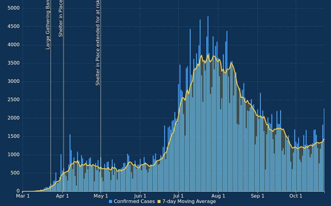
That’s helpful for bureaucrats trying to figure out who is reporting in a timely manner, and who isn’t; and for scumbag media trying to induce perpetual panic. If that chart is all you looked at, and no one told you it was “Date of Report,” you’d think Georgia was surging again. Compare that to the chart graphing new cases by “Date of Onset” (the date the test was done, not eventually reported).
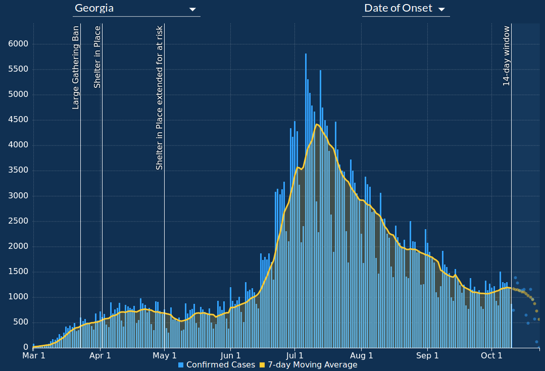
Well, how ’bout that? Doesn’t look much something to panic over, does it? But I’ll pretend hear you say, “But what about the hump peaking in early October? Doesn’t that mean something?”
Yes, it does. Let’s look at yet another chart. This is total testing, by date of test. Not positive cases, but the number of all PCR tests, positive or negative, each day.
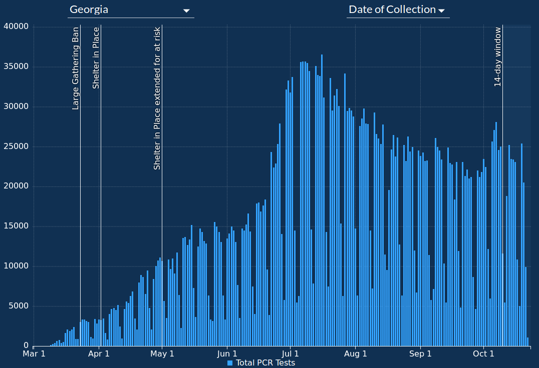
Notice that humps in cases coincides with humps in testing. In fact, every discontinuity in new cases correlates with a surge or decrease in testing. Check your state; I’ll bet you’ll find a similar correlation.
Take a look at one last graph. This one is the percent of positive tests for each day.
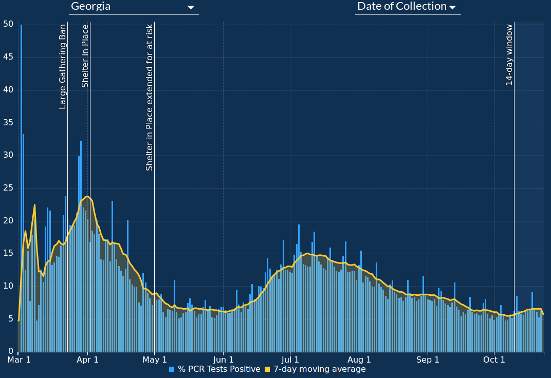
A little explanation is in order. At the beginning of this shitshow, you had to have ChinCOVID-type symptoms to get tested at all. So if you’re only testing those likely to have the illness, then your percent positive rate is going to be relatively high. This makes perfectly good sense for diagnosis, but it seriously skews the results if your goal is tracking the progress of an epidemic.
But a week or two after Georgia’s lockdown was lifted, mid-May, PCR testing was opened up for anyone who wanted it, no symptoms required. And as the weeks went by, they opened up more and more free testing locations. That’s why you see a surge in testing,but the percent positive never again resembles the beginning portion of the “pandemic.”
Percent positive — based on testing anyone — peaked in early July — just peak new cases — and has been dropping ever since. Just news daily cases has been dropping.
Despite the lockdown lifting, no mask mandate (and damned few people wearing them), businesses reopening, schools reopening… despite folks in Georgia mostly trying to live a normal life, the “pandemic” is ending. There is no second surge here.
ChinCOVID deaths in Georgia peaked in early August (which makes sense; they got sick in the early July case peak, and finally died), and have been declining ever since.
Locally, in my county, we did have a late September/early October surge, but that was attributable to a single nursing home that — rumor has it — made some medically insane administrative decisions guaranteed to sicken and kill the vulnerable. If what I heard about that is true, someone in admin should face negligent homicide charges at the very least.
Stick a fork in ChinCOVID; it’s done, in Georgia. Probably in your state, too.
| If you found this post useful, please consider dropping something in my tip jar. I could really use the money, what with ISP bills, rabbit feed, and general life expenses.Click here to donate via PayPal. |